Multi Hover Effect On Blogger Images Using Pure CSS
Today I'm going to show you how to add an amazing mouseover effect for Blogger images using only CSS, in which moving your mouse over an image from different directions (from above, from below, etc) will cause an overlay transitioned in from the same vector. This trick will change not only the images appearance when moving mouse over them, but will also allow you to add inside a text with a description.
You can see the effect on this image below: try moving your mouse from the left, right, and above.
Step 1. From Blogger Dashboard, go to Template and press the Edit HTML button
Step 2. Search for the </head> tag - to find it, click anywhere inside the code area, press CTRL + F keys and type it in the search box.
Step 3. After you found it, add the following style just above it:
Now we are going to add the HTML that is nothing but a DIV where we included four SPAN tags with texts and an image:
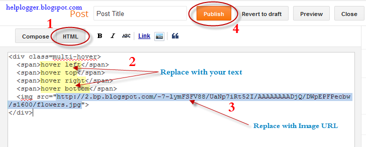
Step 5. Choose Posts, create a New Post, click on the HTML tab (1) and paste this code inside the empty box:
Important! Do not click on the Compose tab, otherwise the changes will be lost.
Step 6. After you finished editing your post, click Publish (4)
And that's it... enjoy! :)
You can see the effect on this image below: try moving your mouse from the left, right, and above.
hover right hover top hover left hover bottom

Adding Hover Effect From Different Directions on Blogger Images
First thing to do is to add the CSS style to our Template:Step 1. From Blogger Dashboard, go to Template and press the Edit HTML button
Step 2. Search for the </head> tag - to find it, click anywhere inside the code area, press CTRL + F keys and type it in the search box.
Step 3. After you found it, add the following style just above it:
<style>Step 4. Save the Template
/* The container and the image */
div.multi-hover {
overflow: hidden;
position: relative;
vertical-align: middle;
width: 100%;
height: 358px;
line-height: 358px;
}
div.multi-hover img {width: 100%;}
/* The texts that, by default, are hidden */
div.multi-hover span {
color: #FFF;
font-size: 32px;
font-weight: bold;
height: 100%;
opacity: 0;
position: absolute;
text-align: center;
transition: all 0.3s linear 0s;
width: 100%;
}
/* And this is what will generate the effect */
div.multi-hover span:nth-child(1) { /* right */
background: none repeat scroll 0 0 rgba(255, 189, 36, 0.6);
left: 90%;
top: 0;
}
div.multi-hover span:nth-child(2) { /* top */
background: none repeat scroll 0 0 rgba(106, 170, 255, 0.6);
left: 0;
top: -80%;
}
div.multi-hover span:nth-child(3) { /* left */
background: none repeat scroll 0 0 rgba(204, 87, 166, 0.6);
left: -90%;
top: 0;
}
div.multi-hover span:nth-child(4) { /* bottom */
background: none repeat scroll 0 0 rgba(97, 181, 115, 0.6);
left: 0;
top: 80%;
}
div.multi-hover span:hover {opacity: 1;}
div.multi-hover span:nth-child(2n+1):hover {left: 0;}
div.multi-hover span:nth-child(2n):hover {top: 0;}
</style>
Now we are going to add the HTML that is nothing but a DIV where we included four SPAN tags with texts and an image:
Step 5. Choose Posts, create a New Post, click on the HTML tab (1) and paste this code inside the empty box:
<div class=multi-hover>Add your own text/description to "hover right", "hover top", "hover left" and "hover bottom" (2) and replace the url in blue with the image URL (3) where you want to apply the effect.
<span>hover right</span>
<span>hover top</span>
<span>hover left</span>
<span>hover bottom</span>
<img src="https://blogger.googleusercontent.com/img/b/R29vZ2xl/AVvXsEhziK8hvP1IMvPTXDHKwX1VIL0vmAhv-PZep3Yz7Fj7k3ANFPs42ylbuIR0C9IUVljqDCycvEfvKvNNidELWK0osSNQ4mgyWcL-rvdRc6KBR44rFFapD9Gi3tDy6IbFR0CzSaemAFK5h7M/s1600/flowers">
</div>
Important! Do not click on the Compose tab, otherwise the changes will be lost.
Step 6. After you finished editing your post, click Publish (4)
And that's it... enjoy! :)


0 komentar:
Posting Komentar