Tampilkan postingan dengan label Image Effects. Tampilkan semua postingan

Rounded Corners and Shadows for Images using CSS

Here are some unique border styles that you can apply to blogger images by using the border-radius property and defining either all four corners simultaneously or applying the rounded border only to some of them.

One of the advantages of CSS3 is that we can apply rounded borders without complicating things too much and one of the options would be to use these edges or borders to images in the blog posts, to which we can also add some hover effects such as shading and rounded borders accompanied by transitions.

Note: if you need more info about how to add rounded corners on images, follow these links:
- CSS Basics. How to Apply Rounded Corners On Images #1
- CSS Basics. How to Apply Rounded Corners On Images #2

Below are a few examples of these borders and how the images behave when you hover over them.
If you want to use one of these styles, just copy the code below the image, then go to Template, click on the Edit HTML button and paste that code before ]]></b:skin> (CTRL + F to find it)
.post-body img {
border:0;
padding:0;
-moz-transition: all 1s;
-webkit-transition: all 1s;
-o-transition: all 1s;
}
.post-body img:hover {
box-shadow: 0px 0px 15px #000; /* Shadow */
border-radius: 50%; /* Rounded border */
-moz-transition: all 1s;
-webkit-transition: all 1s;
-o-transition: all 1s;
cursor:pointer;
}
.post-body img {
background:#FFF; /* background color around the image */
padding:15px; /* space between border and image */
-moz-transition: all 1s;
-webkit-transition: all 1s;
-o-transition: all 1s;
}
.post-body img:hover {
box-shadow: 0px 0px 15px #000; /* Shadow */
border-radius: 0% 50%; /* Rounded border */
-moz-transition: all 1s;
-webkit-transition: all 1s;
-o-transition: all 1s;
cursor:pointer;
}
.post-body img {
background:#FFF; /* the background color around the image */
padding:15px; /* The Space Between Border and Image */
border-radius: 50% 0; /* Rounded border */
box-shadow: 0px 0px 15px #000; /* Shadow */
-moz-transition: all 1s;
-webkit-transition: all 1s;
-o-transition: all 1s;
}
.post-body img:hover {
border-radius:0; /* This removes the border roundness (value 0) */
-moz-transition: all 1s;
-webkit-transition: all 1s;
-o-transition: all 1s;
cursor:pointer;
}
.post-body img {
box-shadow: 0px 0px 15px #000; /* Shadow */
border-radius: 50%; /* Rounded border */
border:0;
padding:0;
-moz-transition: all 1s;
-webkit-transition: all 1s;
-o-transition: all 1s;
}
.post-body img:hover {
box-shadow: 0; /* With this we remove the shadow (value 0) */
border-radius: 0; /* This removes the border roundness (value 0) */
-moz-transition: all 1s;
-webkit-transition: all 1s;
-o-transition: all 1s;
cursor:pointer;
}
.post-body img {
border-radius: 45% / 20%; /* Rounded border */
box-shadow: 0px 0px 15px #000; /* Shadow */
padding:0;
-moz-transition: all 1s;
-webkit-transition: all 1s;
-o-transition: all 1s;
}
.post-body img:hover {
border-radius: 0; /* This removes the roundness of border (value 0) */
-moz-transition: all 1s;
-webkit-transition: all 1s;
-o-transition: all 1s;
cursor:pointer;
}
So these effects will apply to all images uploaded to your Blogger posts. But if you want to apply them only on certain pictures then change .post-body img with .rounded  and .post-body img:hover with .rounded:hover
Then add the rounded class selector in the image's code:
<img class="rounded" src="Image URL"/>
These are just some examples, however, you can modify them anytime by adding or deleting more CSS styles, it depends on everybody's tastes or needs. But as you have seen, we can make the images look way more attractive and this has been done only with CSS ;)

Upload images and get the URL of the image

As each day there are lots of new users joining the world of blogging, is necessary to discuss about some basic topics that bring up some recurring questions such as how we could get the URL of an image?

On the Internet there are many both free as well as paid web hosting where we can host images, but since we use Blogger then there is nothing better than using the same hosting service that Google gives us and that is Picasa.

The fastest way to upload an image is by going to the Blogger post editor. From your Blogger Dashboard, go to your blog, then click on the New post button. And preferably from the Edit HTML tab, click on the image icon.

A pop-up window will open, then click on the Choose files button, browse for your image(s), double click or click on Open and then hit Add selected.

When you have uploaded you will see that in the post editor shows the code of the image.


That code is the URL of the image. You'll see two URLs (Web addresses):
<a href="https://blogger.googleusercontent.com/img/b/R29vZ2xl/AVvXsEiqD3WXvpAKu2KFO9nOcm8GhZaWjs8jx9icwKxYEdvEMf_F01vDAvYfDwgR42f5Pi3nnsc2gwS5wJmOs3oVVcd59e3rE6BEdalZMcsBrc75-qTiZOcc8dfwhTZQZMCNtGF5fSBMNWutOxNS/s1600/Bliss-Windows-XP.png" imageanchor="1"><img border="0" src="https://blogger.googleusercontent.com/img/b/R29vZ2xl/AVvXsEiqD3WXvpAKu2KFO9nOcm8GhZaWjs8jx9icwKxYEdvEMf_F01vDAvYfDwgR42f5Pi3nnsc2gwS5wJmOs3oVVcd59e3rE6BEdalZMcsBrc75-qTiZOcc8dfwhTZQZMCNtGF5fSBMNWutOxNS/s320/Bliss-Windows-XP.png" /></a>

The first is the URL of the image that you need to take. It is not necessary to publish this entry where you uploaded the picture, you could as well not publish it, leave it as a draft or delete it, the image will be saved anyway on PicasaWeb (unless when you removed the draft, you have also selected the image to remove). You could also upload image directly from Picasa. Just login to PicasaWeb, select the album where you want to host the image, and click on Add photos.


Select the image from your computer and upload it.


After we have uploaded, click on OK.

There you will see the thumbnail, along with other photos, if there are more.

If you want to get the URL of the image from Picasa then click on the image to open in full size.
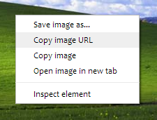
With the right mouse button click on the picture and select option depending on the browser you use...

If using Google Chrome, then select Copy Image URL:


If you are using Mozilla Firefox select Copy Image Location:


If you are using Opera select Copy Image URL:


If you are using Safari select Copy Image Address:


If you are using Internet Explorer (I hope not), first select Properties, a window will open, there you will find the Address section from where you can select the URL of the image and copy it:


Having selected any of these options you'll have in the clipboard the URL of the image. Simple isn't it?

Remember that all images you upload on Blogger are stored in your Picasa account, so if you find an image previously uploaded to your blog, go to your Picasa account, select the album containing the name of your blog and there find the picture you need. The procedure to obtain the URL of the image is the same as explained above.

Possibly the most simple jQuery Slider

Do you have jQuery in your blog and space to insert 10 lines of code? If the answer is yes and you also want to have an automatic slideshow, this is the simplest code I've seen so far.

That code having a succession of simple images placed inside a box with a common general container would give this result:


1. Adding the JavaScript

If you do not have jQuery, then you should add this line just after ]]></b:skin> to load this popular slideshow:
<script src='http://ajax.googleapis.com/ajax/libs/jquery/1.8/jquery.min.js' type='text/javascript'/>

Once confident that we have the library in our template, we need to add the same line to make the series of images function as a slider:
<script type="text/javascript">//<![CDATA[
$(function(){
    $('#slider div:gt(0)').hide();
    setInterval(function(){
      $('#slider div:first-child').fadeOut(0)
         .next('div').fadeIn(1000)
         .end().appendTo('#slider');}, 4000);
});
//]]></script>

We can save changes to the template because that is all. It is simple but you will see that it works and does what it has to do. Now we just have to put the images where we want to display, in the manner discussed below.

2. Create the slider

After adding the codes above in our template (although you could add it directly into a gadget, on a page or even in an entry as you see here) we can create a viewer as you saw above. We just have to use this HTML structure below to add the images:
<div id="slider">
    <div><img src="IMAGE_URL"/></div>
    <div><img src="IMAGE_URL"/></div>
    <div><img src="IMAGE_URL"/></div>
</div>

I do not know how you see it but it is all you need.

For me this is quite lightweight and efficient, much more than most libraries that are used perhaps too often.

Settings


The last three numbers of the plugin allow us to adjust some things. All are expressed in milliseconds (4000 = 4 seconds)

fadeOut(0): Time for the outgoing image
fadeIn(1000): Time for the next image
('#slider');},4000): Time spent in each image

How it Works


And for the curious who want to learn things...

$('#slider div:gt(0)').hide();
With gt(x) we select all the divs from number x. In this case 0 is the first, so what we do with this line is to hide (hide) all the boxes except the first, which will be the image visible initially.

setInterval(function(){ [what we will do] }, 4000);
We need to reiterate a few things from time to time and we do with setInterval, indicating the delay time between each set.

$('#slider div:first-child').fadeOut(0)
Within each of these intervals we remove (fadeOut) the first box (div:first-child) that is in the relationship of images...

.next('div').fadeIn(1000)
...and we make the following box (next) appearing gradually (fadeIn).

.end().appendTo('#slider');
Finally we have the first image and place it at the end (appendTo) of the "list".

end() resets the count of elements that we move forward with next(). Thus, the first child made earlier to disappear is the one we sent down the stack and not the image that is now visible.

Variants and customization


As you have seen CSS is not necessary for the slider to work, but using it we can change its look, allow the use of images of different sizes, include labels and even improve the transition. Here are some ideas.


DEMO TEXT1


DEMO TEXT2


DEMO TEXT3


We can limit the overall container size and prevent overflow for larger images. And then we will put rounded corners, border and then center them.
#slider {
overflow: hidden;
width: 500px;
height: 300px;
border:3px solid #b8b8b8;
border-radius: 40px;
margin: 0 auto;
padding: 0;
position: relative;
}

If we place the parent boxes of the images absolutely with respect to the general container (for that we put before the relative), these will overlap each other. In this way the fadeOut may give them some time to be "visible" (we changed 0 to 1000) and a smoother transition between images. The mixture of images is produced in the second demo.

In the images, the max-width serves us to always take up the entire width and min-height so that even if they are distorted, there will remain no space below when they are less than 300px.
#slider > div {
position:absolute;
top:0;
left:0;
}
#slider img {
width:100%;
min-height:300px;
margin:0;
padding:0;
border:0;
}

And if we add other elements on the images (in this example a text), we'll just label them with a span or paragraph (p) and position them in the CSS in an absolute manner, placing them in the exact place where we want with top/bottom - left/right.
#slider p {
position: absolute;
bottom: 30px;
left: 0;
display: block;
width: 400px;
height: 24px;
margin:0;
padding: 5px 0;
color: #eee;
background: #990000;
font-size: 22px;
line-height:22px;
text-align:center;
}

The markup in the HTML for this last, includes also a link to the image, so it would be like this:
<div id="slider">
<div><a href="Link_URL1"><img src="Image_URL1" /></a><p>TEXT1</p></div>
<div><a href="Link_URL2"><img src="Image_URL2" /></a><p>TEXT2</p></div>
<div><a href="Link_URL3"><img src="Image_URL3" /></a><p>TEXT3</p></div>
</div>

Multi Hover Effect On Blogger Images Using Pure CSS

Today I'm going to show you how to add an amazing mouseover effect for Blogger images using only CSS, in which moving your mouse over an image from different directions (from above, from below, etc) will cause an overlay transitioned in from the same vector. This trick will change not only the images appearance when moving mouse over them, but will also allow you to add inside a text with a description.

hover effect, mouseover, blogger hover effects

You can see the effect on this image below: try moving your mouse from the left, right, and above.

hover right hover top hover left hover bottom

Adding Hover Effect From Different Directions on Blogger Images

First thing to do is to add the CSS style to our Template:

Step 1. From Blogger Dashboard, go to Template and press the Edit HTML button


Step 2. Search for the </head> tag - to find it, click anywhere inside the code area, press CTRL + F keys and type it in the search box.


Step 3. After you found it, add the following style just above it: 
<style>
  /* The container and the image */
  div.multi-hover {
    overflow: hidden;
    position: relative;
    vertical-align: middle;
    width: 100%;
    height: 358px;
    line-height: 358px;
  }
  div.multi-hover img {width: 100%;}

/* The texts that, by default, are hidden */
  div.multi-hover span {
    color: #FFF;
    font-size: 32px;
    font-weight: bold;
    height: 100%;
    opacity: 0;
    position: absolute;
    text-align: center;
    transition: all 0.3s linear 0s;
    width: 100%;
  }

/* And this is what will generate the effect */
  div.multi-hover span:nth-child(1) { /* right */
    background: none repeat scroll 0 0 rgba(255, 189, 36, 0.6);
    left: 90%;
    top: 0;
  }
  div.multi-hover span:nth-child(2) { /* top */
    background: none repeat scroll 0 0 rgba(106, 170, 255, 0.6);
    left: 0;
    top: -80%;
  }
  div.multi-hover span:nth-child(3) { /* left */
    background: none repeat scroll 0 0 rgba(204, 87, 166, 0.6);
    left: -90%;
    top: 0;
  }
  div.multi-hover span:nth-child(4) { /* bottom */
    background: none repeat scroll 0 0  rgba(97, 181, 115, 0.6);
    left: 0;
    top: 80%;
  }

  div.multi-hover span:hover {opacity: 1;}
  div.multi-hover span:nth-child(2n+1):hover {left: 0;}
  div.multi-hover span:nth-child(2n):hover {top: 0;}

</style>
Step 4. Save the Template

Now we are going to add the HTML that is nothing but a DIV where we included four SPAN tags with texts and an image:

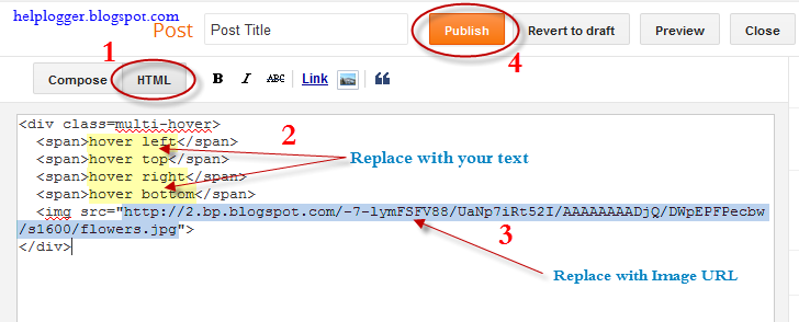
Step 5. Choose Posts, create a New Post, click on the HTML tab (1) and paste this code inside the empty box:
<div class=multi-hover>
  <span>hover right</span>
  <span>hover top</span>
  <span>hover left</span>
  <span>hover bottom</span>
  <img src="https://blogger.googleusercontent.com/img/b/R29vZ2xl/AVvXsEhziK8hvP1IMvPTXDHKwX1VIL0vmAhv-PZep3Yz7Fj7k3ANFPs42ylbuIR0C9IUVljqDCycvEfvKvNNidELWK0osSNQ4mgyWcL-rvdRc6KBR44rFFapD9Gi3tDy6IbFR0CzSaemAFK5h7M/s1600/flowers">
</div>
Add your own text/description to "hover right", "hover top", "hover left" and "hover bottom" (2) and replace the url in blue with the image URL (3) where you want to apply the effect.

Important! Do not click on the Compose tab, otherwise the changes will be lost.


Step 6. After you finished editing your post, click Publish (4)

And that's it... enjoy! :)

CSS Basics. How to Apply Rounded Corners On Images #2

blogger tricks, css tricks, border radiusIn the previous post I have mentioned that we will learn to round images using CSS, without needing to edit them one by one using a program. Now that we have seen the basics of CSS, let's try to apply to some images.

What we will do is to upload an image as normal (HTML) and then add some rules in our style sheet that will transform the outer shape as a circle... or at least to appear round. This will depend on the proportions of image that we use.

In fact, we can apply this effect to any image, to all of an area or to all in our blog. That depends on your tastes.

Marking up HTML

Obviously the first thing we need for in order to round an image is an idem. The code could be more complicated, but an image is built within the img tag and basically looks like this:

<img src="image_URL"/>

Screenshot:


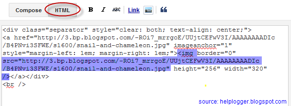
This is how we make it look something like the one from the left. Normally, it should also keep an alt text and sometimes it carries some forced dimensions (with width and/or height). When you upload an image, the code inside the Blogger editor also contains a link that is pointing to the original image.

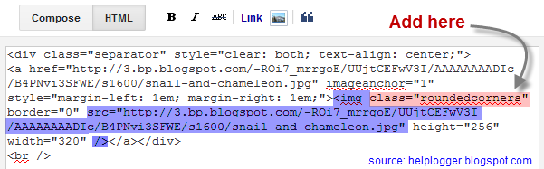
But if we want to modify this image using CSS, we need to incorporate a class selector. We can add it in two ways: within the img tag or to a parent box. The name that I have chosen for the selector is roundedcorners:

<img class="roundedcorners" src="image_URL"/>


<div class="roundedcorners">
<img src="image_URL"/>
</div>


Applying style to all homogeneous elements

But that selector alone will do nothing. It needs to be linked to a style rule that tells what to do with it. As much as we add classes, if these are not defined in the CSS, the appearance of the image (or a certain element) will not change.

To change the shape of all the images on our blog, this would be what we should add to our CSS:

img {
border: 2px solid #BADA55;
margin: 0;
padding: 0;
border-radius: 900px;
-moz-border-radius: 900px;
}

And how it translates to your browser? As follows:

Search for images by name tag (img) and apply the following style:
  • a solid green border of 2 pixels
  • margins (space outside the border) and padding (space inside the border) is set to zero
  • the image is round at the four corners

Now that we have this rule in our style sheet itself, we can see the picture as we wanted - see the example on the right.

To declare a property correctly, we need to know what it does and how to write and you can find more info in many places, although W3C is the authority in this.

For example border-radius requires initially 4 values reading from left to right that represent the roundness of the upper-left, upper-right, lower-right and lower-left corner. If you put a single value is understood that all four will be equal to that.

You should also know that when the value of the border exceeds the dimensions of the box, this border is adapted to form a circle.

How to Apply Style to the Elements of the Same Block

But surely we do not want all the blog images to be round, but only those that we choose, otherwise adding the above style in the head tag will make all of our blog images to take this shape. Before we used an HTML tag (img) and not a selector and that is why the style will affect all images.

To avoid this, we can do one of the things we saw at the beginning and that was to put the image inside a div with the roundedcorners class. In this way, only the images that are in a box with that class will be affected by the rule that will make them round.

<div class="roundedcorners"><img src="image_URL"/></div>

But the rule then should not attack the img tag directly, but the roundedcorners selector. In this case, you should write it like this:

.roundedcorners img {
border: 2px solid #BADA55;
....
}

This means that this style applies only to images that are in a box with roundedcorners class.

Epilogue

To close the subtopic of rounding images, you have to keep in mind that if these are not square, instead of becoming circular, they will look oval.


To fix this we should add the width and height with the same measure (value in pixels), that is to force the image cropping and to make it appear perfectly circular. That was all!

If you enjoy reading this blog, please share and subscribe. For any questions, drop a comment below ;)


CSS Basics. How to Apply Rounded Corners On Images #1

This tutorial will explain how to change the outside border of any image using some simple CSS rules to make it round, but this is so easy to do, that I'm finally going to make this entry for other purposes.
rounded corners, css tricks, blogger tricks, blogger design
The trick today that I'm going to publish in two parts is to help to understand at least a little of what CSS (Cascading Style Sheets) is. But very briefly that I'm not able to do a good comprehensive manual on the subject. For those who want to see a bit more, take a look at this link and for those who really want to learn thoroughly, I recommend to visit this site.

Introduction and terminology

Style sheets aim to help sort out what is the structure of a website and which is its format, its appearance. Thus, the CSS box model is essentially a box that wraps around HTML elements, and it dictates how those boxes are presented in terms of colors, fonts, width, backgrounds etc.

The advantage is that if in the future we decide to change something, we don't have to change all the pages one by one, but simply change the properties of one kind or another box from the style sheet and these changes will automatically apply in all the pages.

The style sheet is a set of rules, in turn composed of selectors and declarations. The selector is to be used as a nickname or name of what you want to configure from the sheet and apply to the HTML and declarations are properties that are assigned to the desired values ​​(more information on CSS syntax)

Adding the CSS selector

Once we put for example the one above in our style sheet, we see that in our website... nothing happens. I said that the selector is what relates HTML and CSS so that if we want a box to take these values ​​for width, background color, border and font size (that's what we defined earlier), we need to include the selector, thus:

<div class="SelectorName">Text here</div>

What we have added is a rule that tells the browser to interpret that this box has to be of a certain type or class. A class that was mentioned earlier is called selector having some specific properties and values ​​defined in the style sheet.

Now we'll see how this will change the look of the box, while all others that don't have the SelectorName  name will follow the standard appearance.

Therefore, when we include a rule in a style sheet, or modify an existing one, what happens is that all boxes marked with that selector will change their appearance according to the properties-values ​​that we have defined.

On the contrary, if we want that an unmarked box to change its appearance with the CSS rules defined, we'll add the appropriate selector.

Where to add the CSS style

The style can be put in a CSS file. The file is created with all the rules, you get the address and then include the following line in the header of your template. For Blogger, you can add it between <head> and <b:skin><![CDATA[/*:

<link href="syle.css" rel="stylesheet" type="text/css"/>

Note: in blue is where the address of your CSS file should be added.

You can also add the style directly mixed with HTML, inserted between the style tags:

<style>
.SelectorName {
background-color: #EAEAEA;
border: 1px solid #444444;
width: 200px;
font-size: 12px;
}
</style>

It can be inserted into a particular box, as well. In this case, you do not need to add any selector to indicate where the CSS style is:

<div style="background-color: #EAEAEA; border: 1px solid #444444; width: 200px; font-size: 12px;">Text here</div>

In Blogger the rules are between the skin tags, which means they are between <b:skin><![CDATA[/* and ]]></b:skin>. If you edit the template, will find that there are many things in between. All this is CSS that marks the appearance of your blog.

In case we want to see the effect after changing the value of some propriety, we can click on the Preview button. We can also remove anytime a declaration or add another to the desired selector.

For those who don't want to touch the template, you can add the CSS directly by going to the Advanced section > Add CSS of your Template Designer.


That's enough for today. The next tutorial will discuss in more detail about how to add rounded corners to our images using CSS.

Create A Rollover Image Effect (change image on mouseover)

The Rollover effect is one in which an image web object changes (swaps itself) on mouse over to another web object (called rollovers) and reverts back to the original image on mouse out. Rollover images are preloaded into the page when it is loading, this ensures that the rollovers are displayed quickly. The onMouseOver and onMouseOut attributes of the link tag are used to make this functional.

Demo:  Place your mouse over the image below to see its rollover effect


Making Rollover Effect Image

You have the following code:

<a href="URL ADDRESS"><img src="URL OF THE FIRST IMAGE GOES HERE" onmouseover="this.src='URL OF THE SECOND IMAGE GOES HERE'" onmouseout="this.src='URL OF THE FIRST IMAGE GOES HERE'" /></a>

Change the colored texts as it follows:

1. URL ADDRESS

This is the address where somebody will be sent when clicks on the image.
Example, my blog address: http://www.helplogger.blogspot.com

2. URL OF THE FIRST IMAGE GOES HERE

Replace the orange text (two times) with the URL address of the image which will appear before you hover over it.

3. URL OF THE SECOND IMAGE GOES HERE
Replace the text in blue with the url of  the image that will appear when the cursor hovers over it.

Now you can paste your image inside a blog gadget, going to Layout > click on Add a Gadget link (right side) > Select HTML/JavaScript from the pop-up window, then add it to your sidebar.

You can also add it inside your post by going to New Post > Switch to HTML tab and then paste the code in the empty box.

That's it. Enjoy ;)