CSS Basics. How to Apply Rounded Corners On Images #2
 In the previous post I have mentioned that we will learn to round images using CSS, without needing to edit them one by one using a program. Now that we have seen the basics of CSS, let's try to apply to some images.
What we will do is to upload an image as normal (HTML) and then add some rules in our style sheet that will transform the outer shape as a circle... or at least to appear round. This will depend on the proportions of image that we use.
In fact, we can apply this effect to any image, to all of an area or to all in our blog. That depends on your tastes.
Marking up HTML
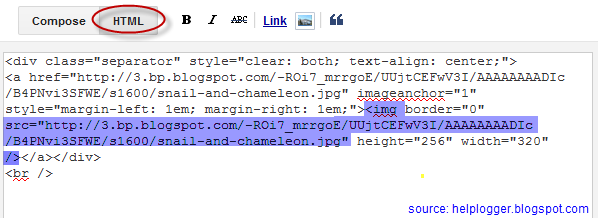
Obviously the first thing we need for in order to round an image is an idem. The code could be more complicated, but an image is built within the img tag and basically looks like this:
<img src="image_URL"/>
Screenshot:

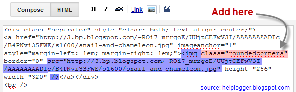
But if we want to modify this image using CSS, we need to incorporate a class selector. We can add it in two ways: within the img tag or to a parent box. The name that I have chosen for the selector is roundedcorners:
<img class="roundedcorners" src="image_URL"/>
<div class="roundedcorners">
<img src="image_URL"/>
</div>
Applying style to all homogeneous elements
But that selector alone will do nothing. It needs to be linked to a style rule that tells what to do with it. As much as we add classes, if these are not defined in the CSS, the appearance of the image (or a certain element) will not change.
To change the shape of all the images on our blog, this would be what we should add to our CSS:
img {
border: 2px solid #BADA55;
margin: 0;
padding: 0;
border-radius: 900px;
-moz-border-radius: 900px;
}
And how it translates to your browser? As follows:
Search for images by name tag (img) and apply the following style:
- a solid green border of 2 pixels
- margins (space outside the border) and padding (space inside the border) is set to zero
- the image is round at the four corners
 Now that we have this rule in our style sheet itself, we can see the picture as we wanted - see the example on the right.
To declare a property correctly, we need to know what it does and how to write and you can find more info in many places, although W3C is the authority in this.
For example border-radius requires initially 4 values reading from left to right that represent the roundness of the upper-left, upper-right, lower-right and lower-left corner. If you put a single value is understood that all four will be equal to that.
You should also know that when the value of the border exceeds the dimensions of the box, this border is adapted to form a circle.
How to Apply Style to the Elements of the Same Block
But surely we do not want all the blog images to be round, but only those that we choose, otherwise adding the above style in the head tag will make all of our blog images to take this shape. Before we used an HTML tag (img) and not a selector and that is why the style will affect all images.
To avoid this, we can do one of the things we saw at the beginning and that was to put the image inside a div with the roundedcorners class. In this way, only the images that are in a box with that class will be affected by the rule that will make them round.
<div class="roundedcorners"><img src="image_URL"/></div>
But the rule then should not attack the img tag directly, but the roundedcorners selector. In this case, you should write it like this:
.roundedcorners img {
border: 2px solid #BADA55;
....
}
This means that this style applies only to images that are in a box with roundedcorners class.
Epilogue
To close the subtopic of rounding images, you have to keep in mind that if these are not square, instead of becoming circular, they will look oval.

To fix this we should add the width and height with the same measure (value in pixels), that is to force the image cropping and to make it appear perfectly circular. That was all!
If you enjoy reading this blog, please share and subscribe. For any questions, drop a comment below ;)
Categories:
Blog Design,
css,
how to,
Image Effects


0 komentar:
Posting Komentar